Monday, 10 January 2011

working towards final piece.

I have decided for my final piece, that I am going to produce a ripped image, including text and other small images. Here are a couple of designs I tried:


To create the silhouette affects, I simply cut out one of my previous images and turned it round, sticking text onto it. The text is from Elle Magazine (Issue February 2011) in an article called 'How to do the longer length'.

final adjustments.


Here, I have cropped the light source out of the image to add mystery to where the light is coming from.


You may have noticed that this image is quite grainy. I would like to point out that this was intentional. In this image, I have increased the contrast even more the crispen out the colours to create a nice contrast between the snow and her pale skin, against the dark tree. It adds a fairytale affect, almost presenting her as an angel or fairy.

final piece experiment continued.

Due to the fact I really liked the ripped affect image, I have decided to extend the idea further by using fashion based words rather than a quoation. Most of the words I chose, I found inspiration from Company Magazine, Issue January 2011. The words I decided to use were, "fashion, style, wardrobe, shop, outfit, fabulous, statement, personality, catwalk, trend, model, sexy and confidence".

Saturday, 8 January 2011

quick shoot edit.


I took a quick shoot of myself, taking nerd fashion into consideration. I edited the image on picnik.com, using the 1960s affect and rounding the corners. I quite like the affects of this image and will definitely consider it for future shoots. Styling inspiration came from Gemma Booth with her geek fashion.

final piece experiment.

Referring back to the ripped images on a previous blog that I came across, I decided on an image and tried the technique myself. Here is how it turned out:


I then went on to insert text on Photoshop, saying:
"fashions fade, style is eternal
- YSL"

I wanted to use a fashion related quote because it would obviously link in with the project theme. I chose the font 'Courier New' because it looks messy and creative, like fashion.


I actually really like the outcome of this image, and most likely will consider the style as a final piece.

further final piece ideas.


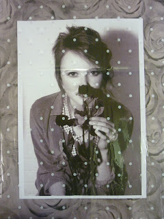
For my final piece, I wanted to produce something creative, rather than simply a picture in a frame. So when I found those materials, I thought maybe I could try layering them ontop of one of my vintage photos from shoot three. (Shown in image above). However, it was decided that this technique was a little too GCSE. So I decided against using this idea.


Referring back to the 'I love you' background image, I thought maybe I could extend this idea further by using lyrics from a band in the 70s, such as The Beatles. I researched some of their songs, and in terms of lyrics, (continuing a romantic sense) my favourites were 'all you need is love', 'real love' and 'she loves you'. So I will be experimenting with these lyrics too. For the image below I have used the first couple of verses and the chorus to 'All you need is love' by The Beatles. I liked the affect when the image and text were overlapping so I created this affect by adjusting the opacity.


Whilst looking through other peoples' blogs, I came across www.aquartzylife.blogspot.com and found a few images that I particularly liked:


I really like the ripped affect of the images and I will try this myself, considering it for a final piece. I will then add a fashion quotation like "Fashions fade, style is eternal" from Yves Saint Laurent. I will do this through using letter from magazines, or scanning the ripped image and inserting it with a unique font.

Thursday, 6 January 2011

using inspiration.

I have used inspiration from the scanned cards and added a little colour onto a particular image.


I have selected a light pink for her nails and red for the roses but with a 1% opacity so the colour doesn't stand out too much, ruining the vintage feel.